Ooni Oven App
Re-design recipes page
Ooni Oven App
Re-design the “recipes” page on Ooni’s app.
My project aims to revitalize the Ooni app, making it a hub for culinary exploration and community. By streamlining the interface, reducing visual clutter, and showcasing exciting recipes and techniques, we'll encourage users to dive deeper, experiment more, and forge a stronger connection with the Ooni brand.
Ooni designs portable wood-fired pizza ovens that cook restaurant-quality pizza in 60 seconds at 950°F/500°C.
Overview
Designlab UX Academy 2023
I aimed to increase user engagement in the Ooni oven app by enhancing its visual hierarchy, reducing visual fatigue, and inspiring users to experiment with new recipes and techniques. The ultimate goal is to strengthen the brand-customer relationship through an app that better meets the needs of users
Deliverables
Qualitative Research
Competitive Analysis
Personas
User Interviews
User Flows
Information Architecture
High Fidelity Wireframing
Problem
Ooni product's app and user engagement challenges offer a chance to improve UX and brand-customer relationships. Enhancing visual hierarchy, and reducing fatigue via strategic design can create a visually appealing interface, elevating success and engagement.
Qualitative Research
Insights gained from the Ooni Reddit forum, which has 20k members, were invaluable in informing my design decisions to reorganize the visual hierarchy of the pizza oven app.
Identifying pain points, such as inconsistent content that has led to trust issues, can enhance user experience, foster better user relationships, and promote a more user-friendly design.
User Interviews
5 participants
Ages 25- 35
10 questions w/ short answer
I want to know about user motivations, experience, pain points, and expectations with Ooni Ovens and the app.
What frustrates you about the oven?
What's the pizza setup process?
Desired app features?
What is the importance of a phone-oven connection?
I think it would be helpful to have more recipes for non-pizza foods.”
35, Denver, CO, USA
Improving Visual Hierarchy
To enhance the layout and make it more captivating, a simple yet effective strategy is to incorporate visual diversity and contrast. By incorporating varying text and image sizes, the layout becomes more dynamic and can effectively highlight featured or crucial information.
Tags were added to help create ease of navigation and related content
The original Ooni design suffered from a lack of visual hierarchy. Varied image sizes help create visual contrast and highlight important articles and recipes
Improving Navigation
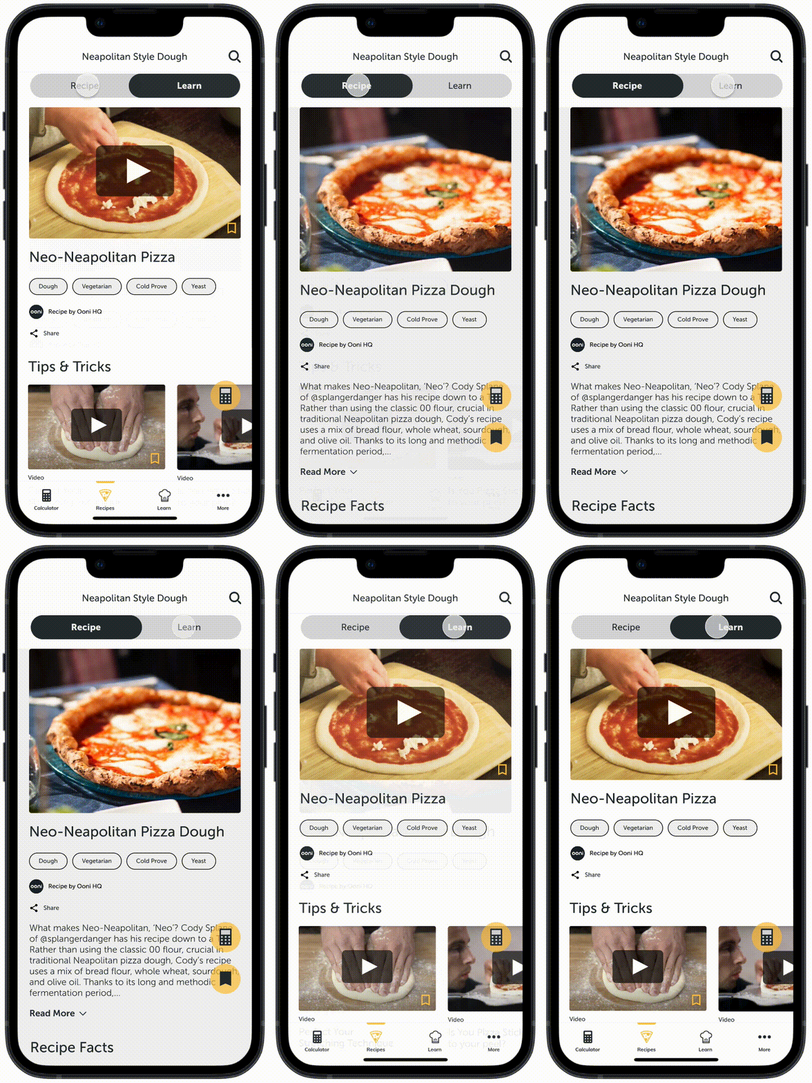
Implementing a tab navigation is a user-friendly solution that enables easy toggling between relevant and related content. This keeps the user within the recipe page and ensures they only view content pertaining to the recipe at hand.
Current User Flow:
Finding a Neapolitan-style pizza dough recipe
Proposed User Flow:
Finding a Neapolitan-style pizza dough
Tab navigation reduces one click for accessing related content without clicking on a new page.
Insights
Usability Test
4 participants
My usability testing revealed two key insights for my app redesign. Users appreciated the varied sizing of recipe posts but still found the content dense and cluttered.
Adding white space helped the design with a clearer content hierarchy to facilitate easy navigation.
50%
of participants found the recipe page cluttered and hard to navigate.
100%
of participants preferred the proposed design to the existing design.
Final Design
01. Improve visual hierarchy
02. Ease of access to information
03. Prioritizing Key Features
01.
Improve Visual Hierarchy
The new layout incorporates eye-catching color blocking, varied text sizes, and large images to draw users' attention to important and featured posts and recipes. Additionally, the organized category tagging and filtering system allows for easy navigation and quick access to the desired content.
The new recipes page helps users navigate the app to find specific recipes easier while discovering new and exciting content
02.
Ease of Access to Information
Creating seamless and fluid navigation is to keep users engaged and empowers them to access relevant information without interrupting their workflow or having to switch to another tab.
03.
Prioritizing Key Features
By leveraging the current design language, I created a floating button that highlights the dough calculator which is the app's most popular feature, enabling seamless adjustments while browsing recipes.
The dough calculator is a key feature that is loved by the Ooni community. By integrating it into part of the recipes page, users are able to utilize the calculator to seamlessly adapt recipes
Learning & Takeaways
Focusing on the project scope
While reorganizing the "Recipes" page, I found opportunities to improve other areas, including crucial parts of site navigation. Staying focused on user pain points identified in research led to a redesign that met their needs.
Good grids, bad grids
I observed that while the app design was consistent and detailed, it lacked personality and felt stale. The content was constrained within a uniform grid with little visual variation, which made the app feel rigid and uninteresting.
Pizza and design
Both are built from simple elements that are combined in specific ways to create a satisfying whole. Like pizza dough, sauce, cheese, and toppings, UX design uses typography, color, and components to create an effective and enjoyable experience.


